Behind the scenes of “Win a $20,000 Kitchen” competition
Ever wanted to know how those lucky people win stuff? Because you’ve never won anything in your life?
It’s probably because you never fill out the applications to enter into them. Who’s got the time to sit there and write in 50 words or less why this new toaster is better than sliced bread?
Well, people do it. And that’s how they win stuff.
Emma won the jackpot, a new kitchen worth $20k. Good on her! (jealous, much?)
I was lucky enough to be working behind the scenes on this competition for Laminex and I’m happy to spill all the juicy details. Most of this stuff has never been released to the public before. You get to peek behind closed doors and see what really happened.
I was the Laminex employee selected, Australia wide, to be the kitchen designer and also help project manage the install.
I’m going to share the process with you, my design drawings. As well as some before and after pics. Enjoy!
WHAT WAS THE COMPETITION ABOUT?
It was a facebook competition, proclaiming the winner's kitchen will be “designed by Australia”. Sounds like fun, but how does that work, you say? Well, the facebook community had to vote on several Laminex colour combinations for the kitchen cupboards, benchtop and splashback. The “design” was something I worked on with Emma and her family but the colour choices were completely out of our hands.
This was Emma’s application:
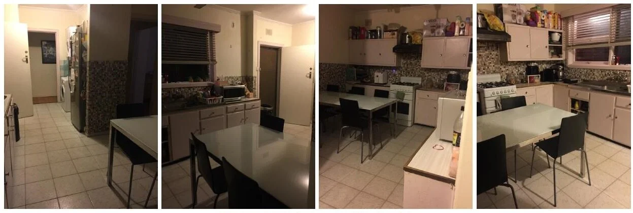
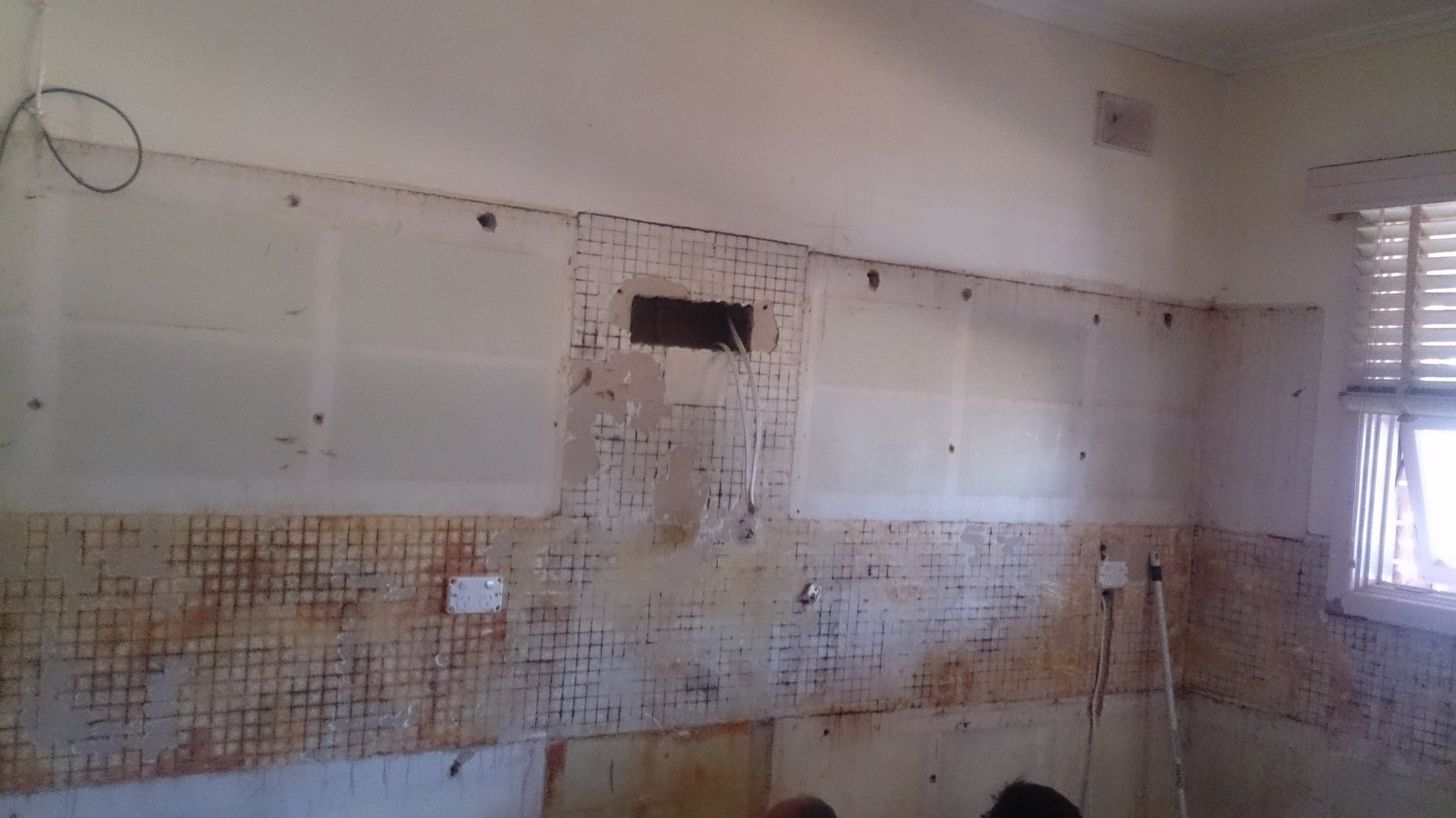
“We still have original kitchen, with small cupboards that doesn't fit or hide away appliances, doors are breaking and makes me feel as though my kitchen is forever horrible and dirty! We have three young children and love baking and entertaining but I'm too embarrassed! Please complete our dream!”
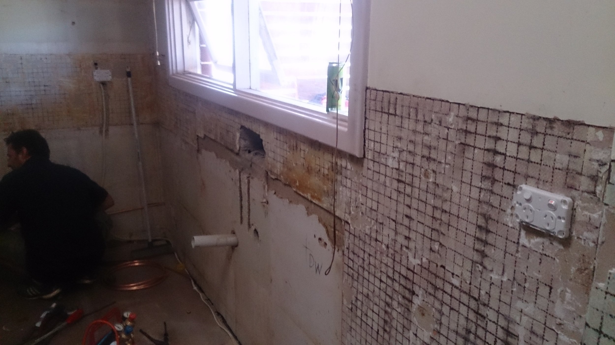
"Before" shots of Emma's Kitchen
WHERE WAS THE pROJECT LOCATED?
We were all excited that a South Australian won the contest. They are a fantastic family and are well deserving of a new kitchen. I had a bit of a “moment” when I first met with Emma because we suddenly realised we knew each other, through family and friends. Which was a bizarre and happy coincidence.
WHAT WAS THE DESIGN BRIEF?
I quickly realised Emma has a large family and her kitchen space is for cooking, dining ...and doing the laundry. The challenge was to fit all these activities into a small space of about 10 square metres. Not easy.
HOW DID I SKETCH IT OUT?
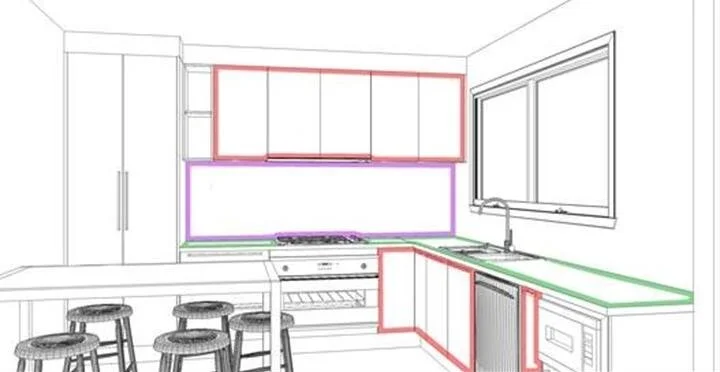
Over the next couple of days, I played around with a lot of different layouts. However, in the end I went back to something very similar to the old one. It really was the best use of space. I just had to bring it into the modern era, with convenient storage solutions and more benchtop space.
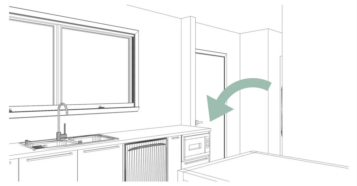
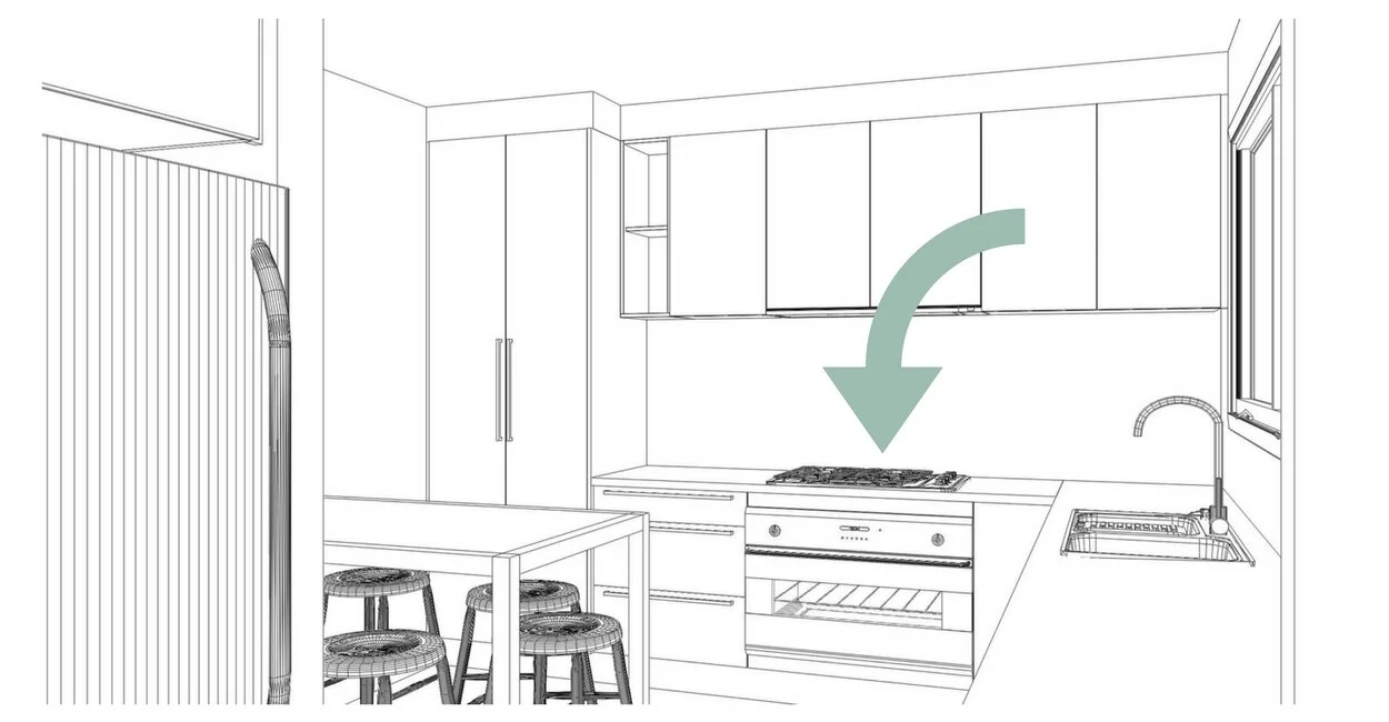
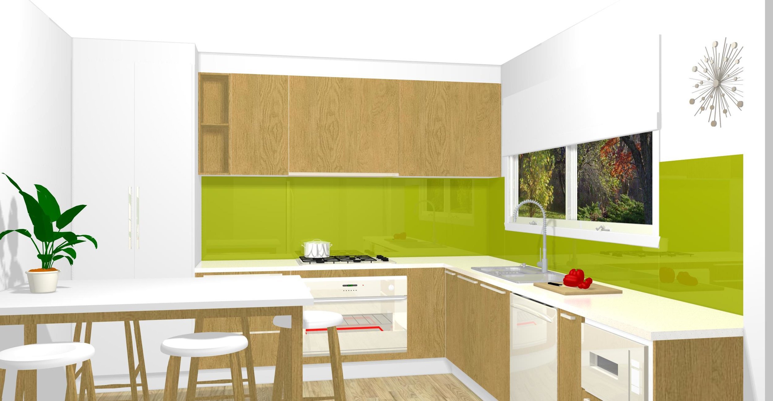
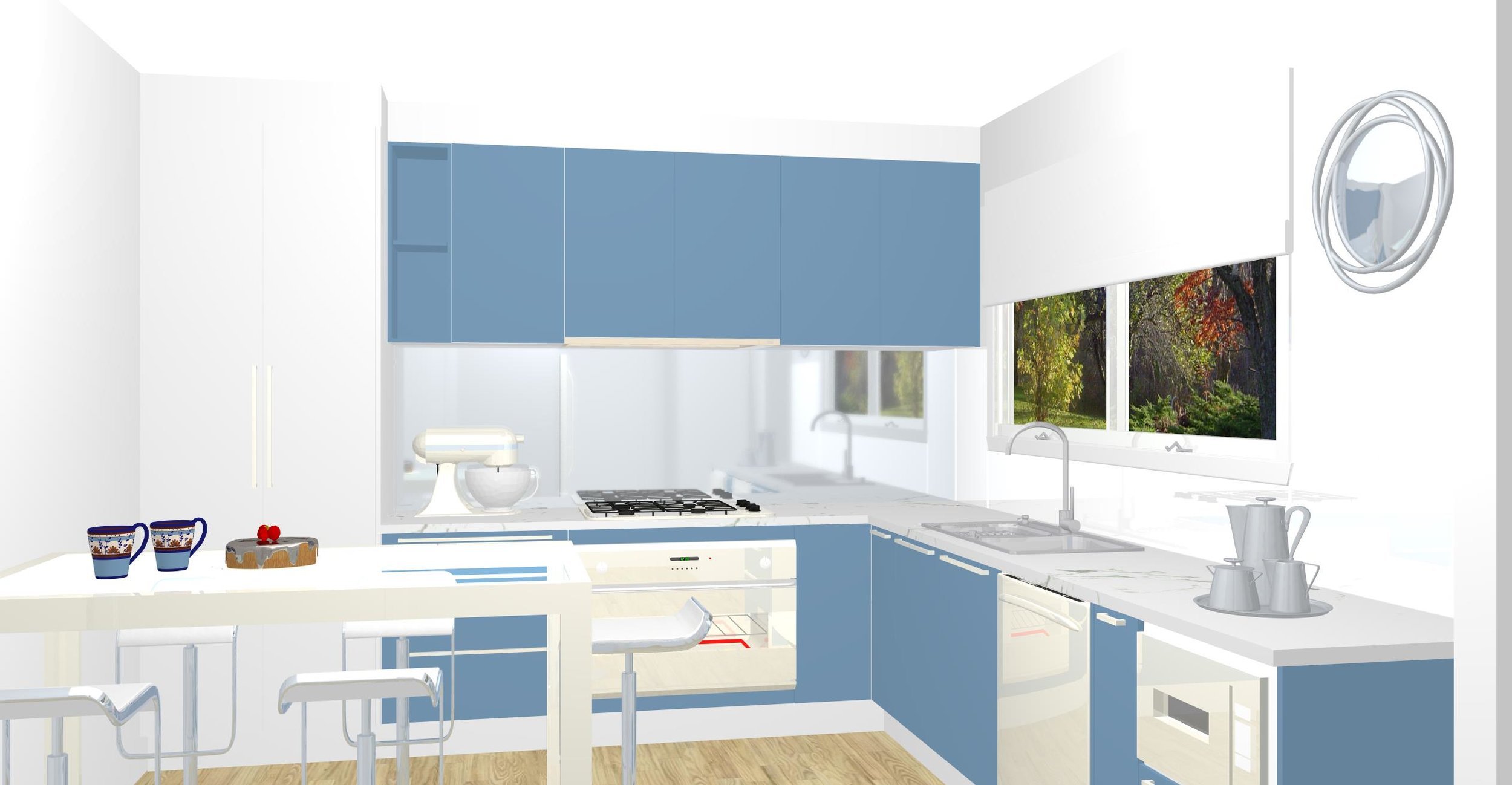
I drew several 3D views in black and white (I call it wireframe views) to demonstrate the new design. This drawing was used on the facebook page for Australia to decide on the colour scheme.
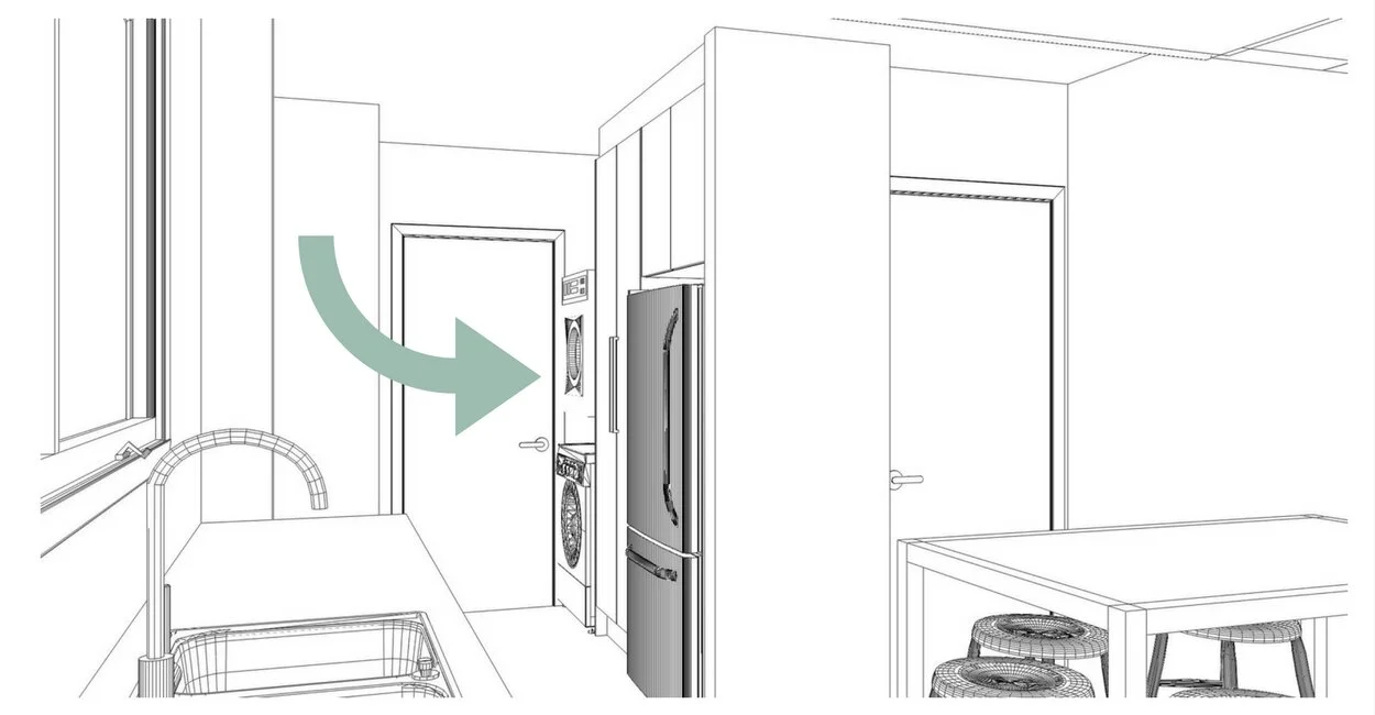
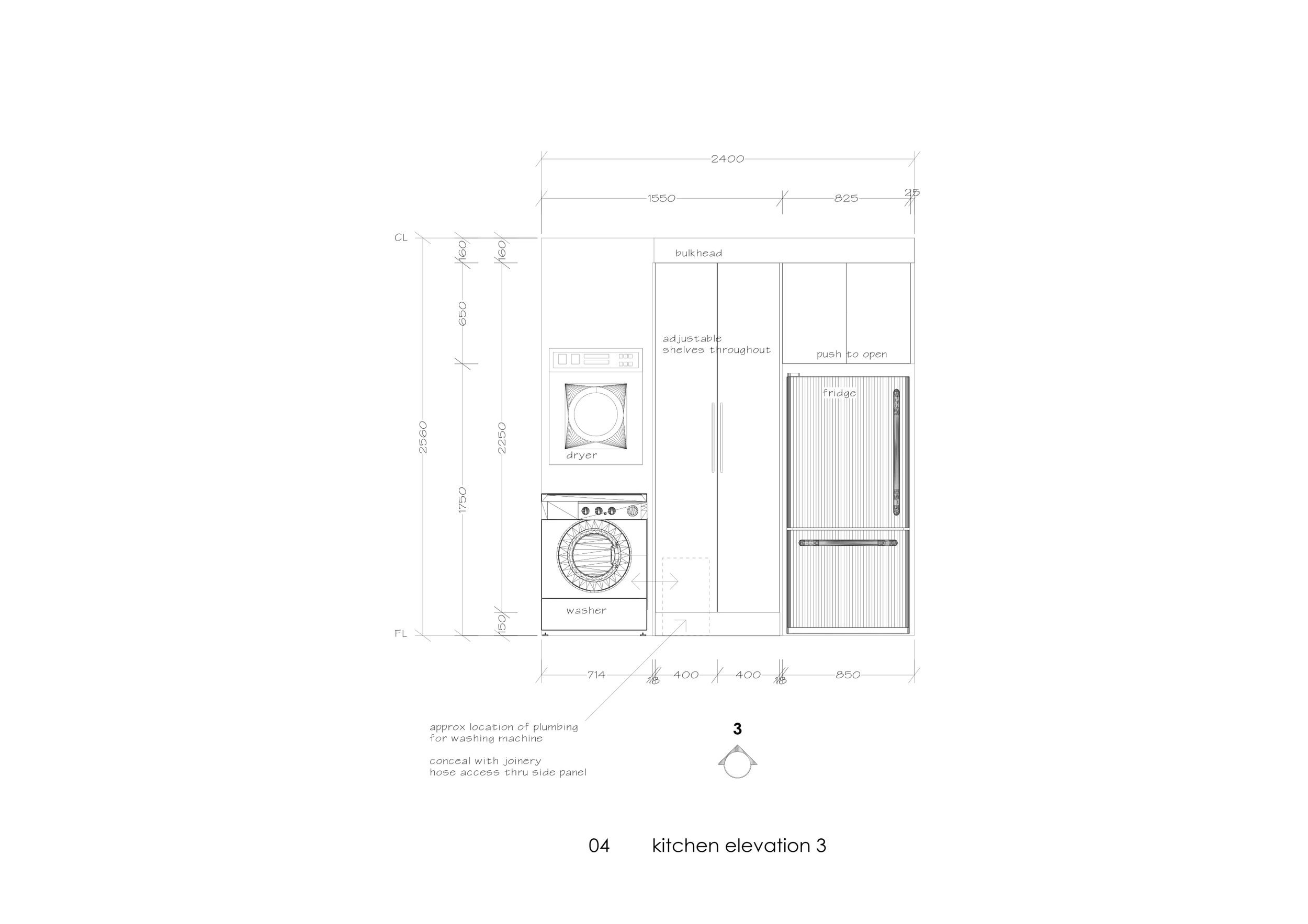
Their laundry is next to their fridge. It would have been nice to put the washing machine and dryer behind doors, but there wasn’t enough space. We settled with removing the old cement trough and put a broom cupboard there. We had to do something clever to hide the plumbing behind joinery and they have lots more storage now.
They use their microwave frequently so it was placed in a prominent position, under bench.
Emma wanted the biggest oven possible (!) and also a dishwasher, which she never had before. Exciting stuff.
The dining space solution was to use a table which is at benchtop height. That way it could be moved around and used for the whole family to eat a meal or it could be used as extra benchtop space for cooking.
SCOPE OF WORK
During this time I also outlined the scope of work, which means I described all the things that needed to be done to complete the renovation.
It’s not just a matter of selecting appliances and door handles. We needed to consider new flooring, light fittings, window coverings, patching up the walls and the ceiling, painting, plumbing and electrical, rangehood ducting through the ceiling… the list goes on.
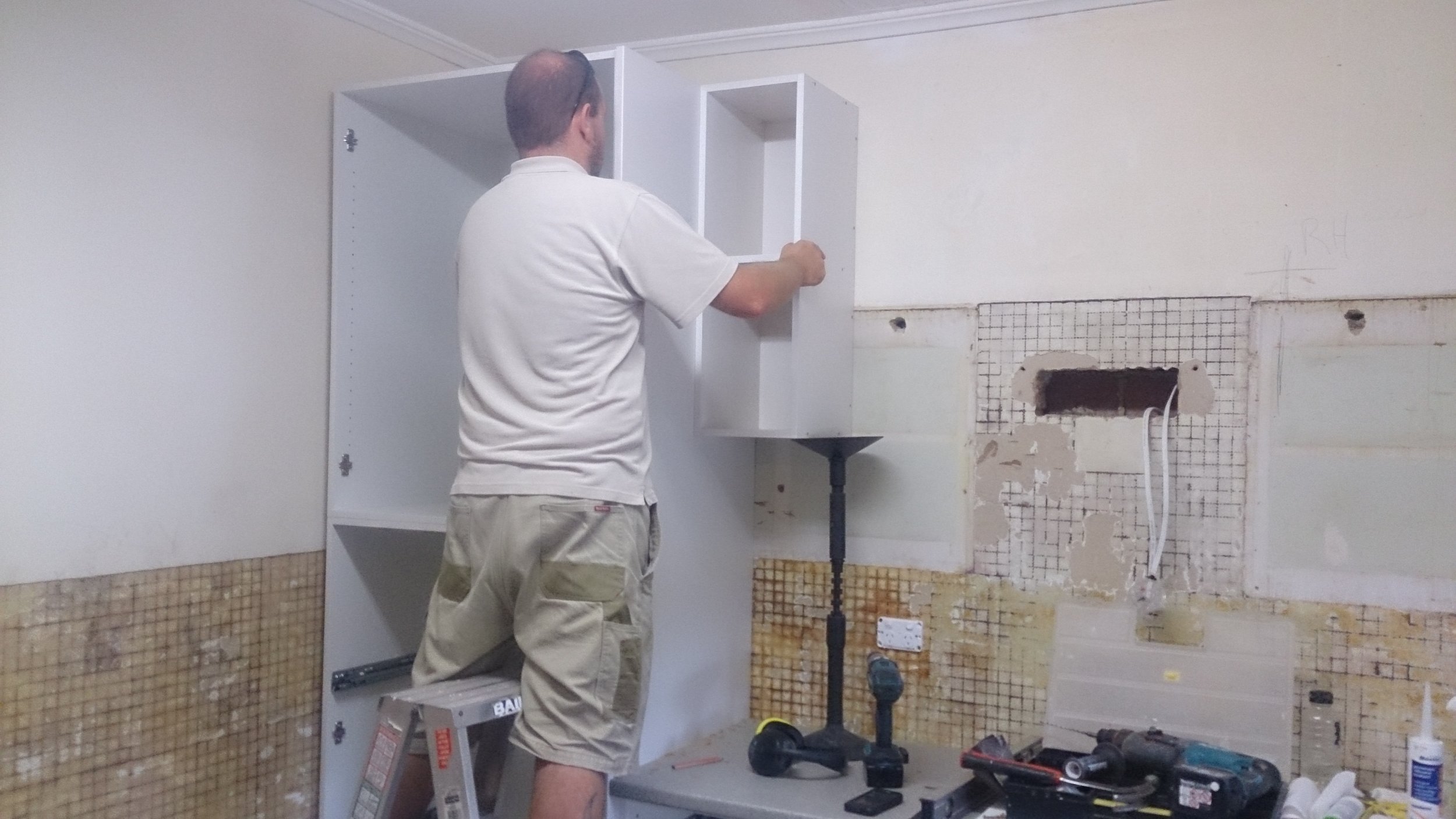
It was also going to be a huge task to remove the old 70’s kitchen as well as all those old tiles on the walls and floor.
hOW DID THE DESIGN PROGRESS?
6 weeks later, I was given 5 different colour schemes that the managers at Laminex wanted to provide as options. These colour schemes were originally created by the facebook community. 5 lucky people won $250 for coming up with them.
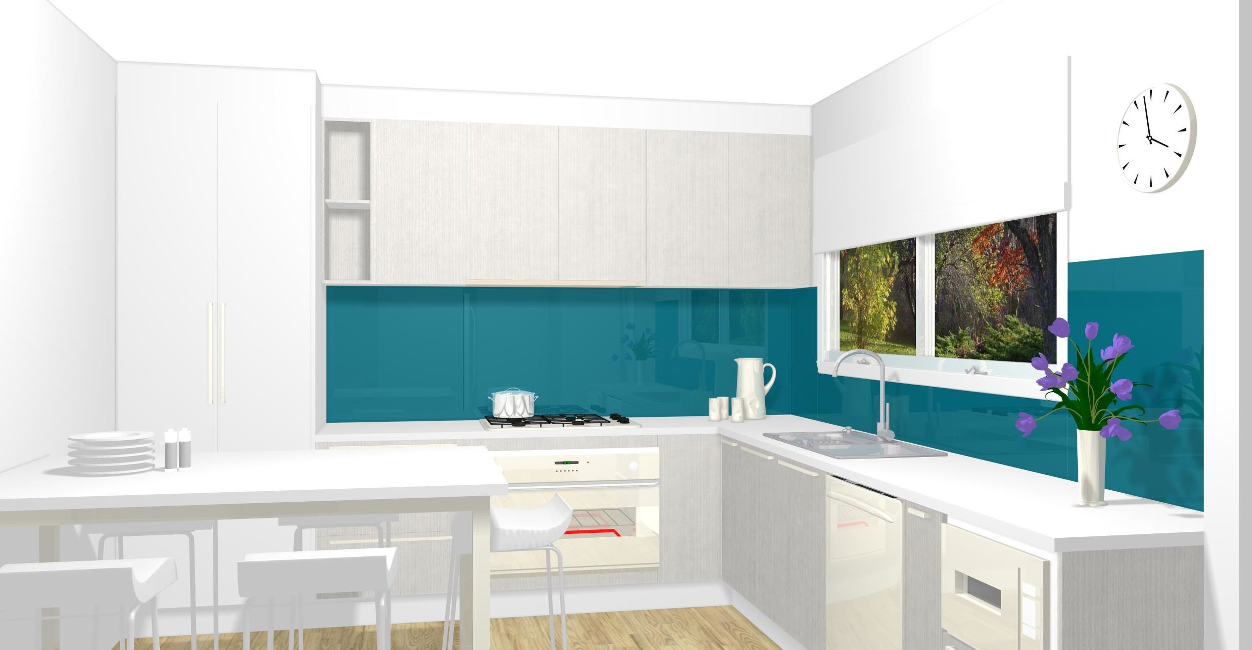
They asked me to draw the kitchen 5 times, with the different colour schemes. And boy, it was tedious ...but fun to see how the different colours effected the feel of the space. Which one do you like best?
Since the space was small and we wanted it to look bright and fresh, I used artistic license to add more white in certain areas. Particularly for the darker coloured and timber grain schemes. We decided to use white on the tall pantry doors. It helped to make the room feel bigger.
The 5 colour schemes I got from the facebook community, came with notes about their ‘vision’ for the space. I tried to reflect on this with the selection of accessories and the style of the furniture in the drawings. A bunch of flowers here, a tea kettle there, etc.
"Australia" voted on which one they liked best.
AND THE WINNER WAS...
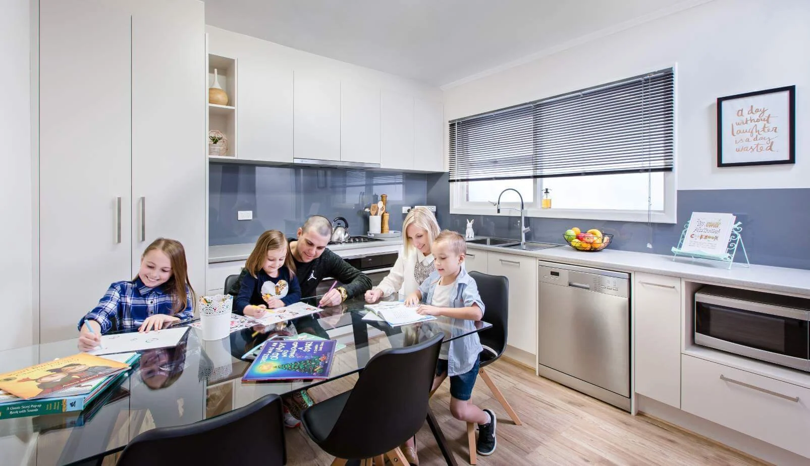
When the results came through, of course Emma was very excited with the outcome and we got to work straight away. Which one was the winner? ...it was the third one, with the grey splashback!
This was the spec:
Doors: Laminex Alpaca, melamine with ABS edge
Benchtop: Laminex Alluvial Stone, natural finish laminate with postformed edge.
Splashback: Metaline Velocity Perle
I completed a detailed floor plan and elevations. These were sent to the selected cabinetmaker Uzit kitchens, the Metaline installer Kym Kelly Designs, and other trades. They gave us a final costing and it went into production.
DID I EXPERIENCE ANY ISSUES?
Yes, the budget. $20k is a lot of money, but it was quickly used up and we had to think strategically about what we could provide. How could we give Emma the best value? What would Emma have to buy for herself or do for herself? We ended up providing her with Formica flooring, as a bonus. And the compromise was she would provide the dining table and chairs.
WHO ELSE COULD BENEFIT FROM A DESIGN LIKE THIS?
A white kitchen is what a lot of people in Australia aspire to have. Let’s face it, it’s a safe colour. However it’s really versatile. If you think you may change your accessories and furniture once in awhile, it’s really easy to do that. If there’s a possibility you may sell your home, this will appeal to most buyers. So it's a win/win for everyone.
Adding the feature colour as your splashback is also wise. It’s relatively easy to change if you need to, and you can create quite an impact with it.
WHERE DO PEOPLE START IF THEY WOULD LIKE A KITCHEN LIKE THIS?
Order the samples first of all. Have a look at them in your space and see how it looks against your flooring and wall colour. A scheme will often look different online or in a showroom than it does in your home.
I often ask people to bring me their flooring sample or show me a picture of the room. It's amazing how a picture or a physical sample can answer so many of my questions. I can then recommend a scheme that will tie in with the rest of their home.
I think if “Australia” had ordered the samples, instead of looking at them on a computer screen, and voting that way. The outcome might have been different.
During all my years of working at Laminex, those exact colours haven’t been the most popular. Saying that, it looks fantastic in the photo. Emma seems really happy with it too, which is the main thing.
Let me know if you would like a free set of the samples, I could hook you up!
Emma and her family, enjoying the new kitchen | source
