Kitchen Greenery
Are you thinking about using a pop of colour in your kitchen but not sure which colour to go with? Hint: make your friends green with envy! Let’s see what the experts have to say...

The folks at Pantone are the experts at predicting trends in colour. Each year they work out which colour best represents the mood and attitude of our global culture.
For 17 years, the Pantone color of the year has influenced the trend in product development and purchasing decisions in many creative sectors. Such as fashion, beauty, industrial design, graphic design, packaging, food, art collections, urban landscapes and of course interior design.
These trends are not only seen in life but because of technology you see the trends on social media, television and print. For the purpose of marketing and self expression.
Colour trends are influenced by the way people live their lives. Much of the time we are now looking at colour on computer screens or mobile devices (like right now). I’m going to say that this has played a big part in the choice for 2017.
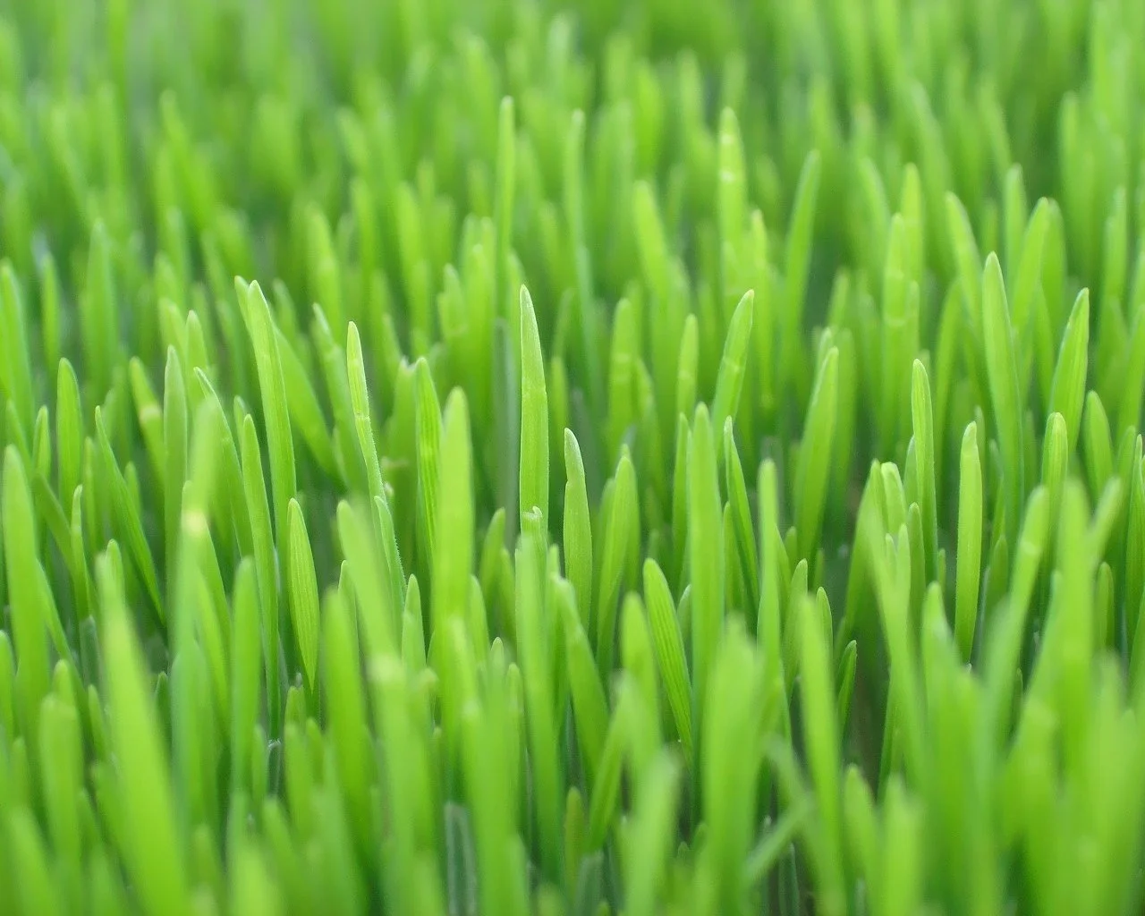
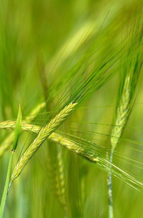
This year the colour is Greenery. It’s almost lime green, or the colour of fresh green grass. We’re talking about a slightly yellow-green that's very uplifting.

Zesty green is a life affirming colour. It gets you away from technology and all the doom and gloom of the current political and social environment.
Every year, the Pantone colour announcement seems like an odd choice. I mean, does anyone like to use lime green? Not really.

But just watch, many designers will be inspired by the colour prediction and you will notice it going into more and more projects.
In a while you will notice that green is fashionable again. You will keep noticing it on fabrics on the runway and furniture, and well, everywhere.
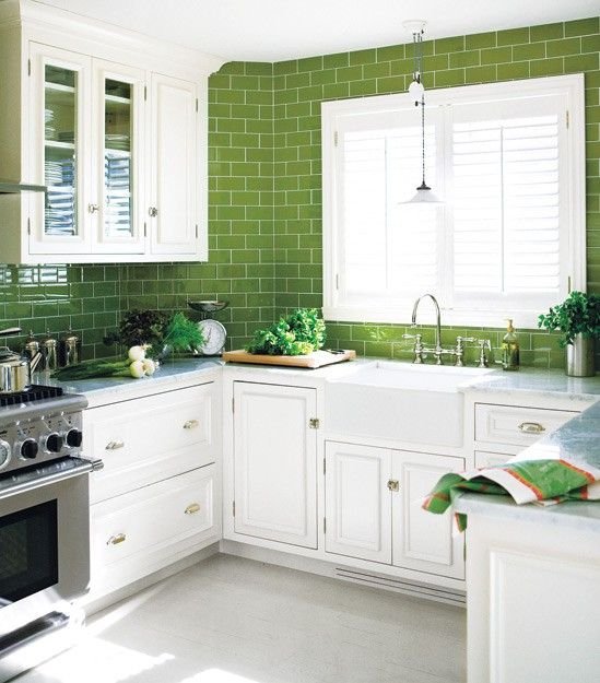
USE POPS OF GREENERY IN YOUR KITCHEN
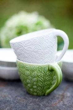
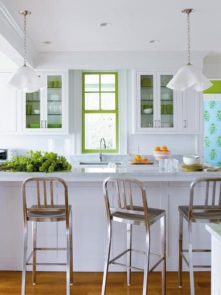
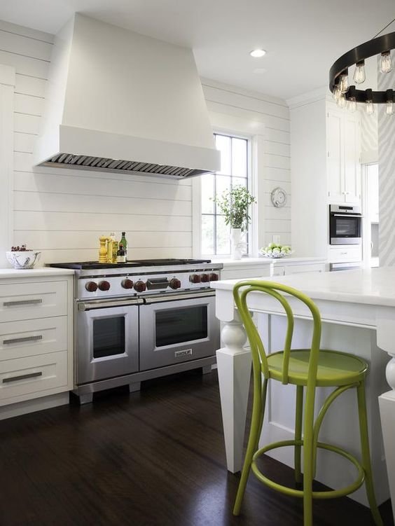
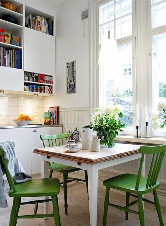
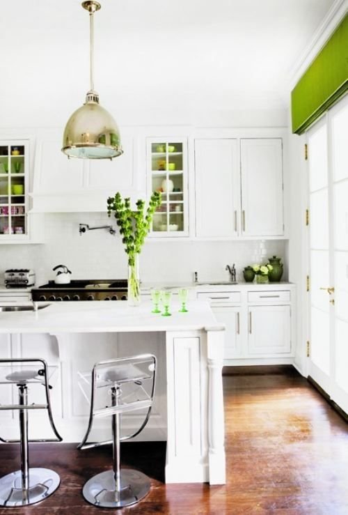
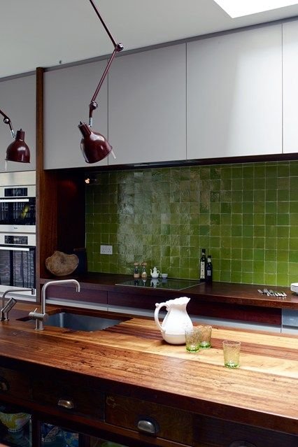
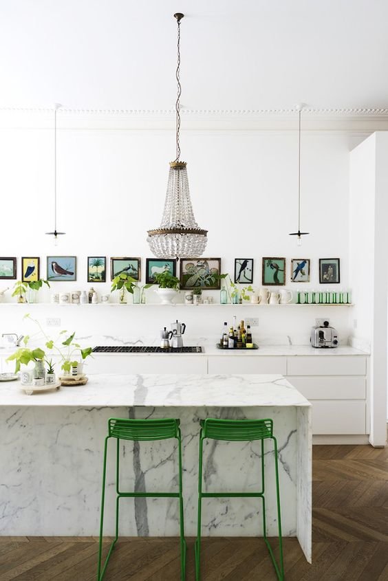
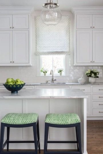
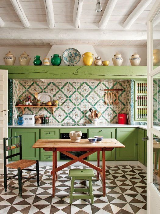
In regards to kitchens, I enjoy seeing pops of Greenery, especially in an all white scheme. It’s a bit of fun, and adds freshness and vibrancy. It would be perfect for a holiday home, or if you want your home to feel like a holiday home.
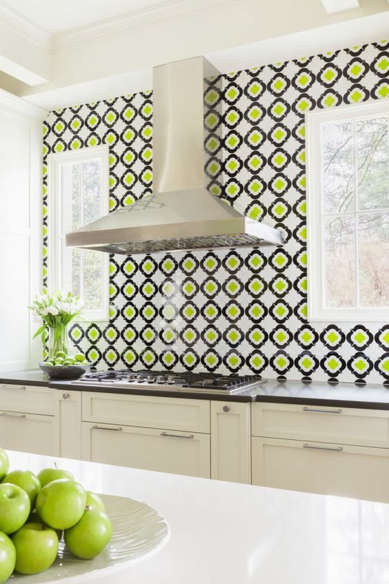
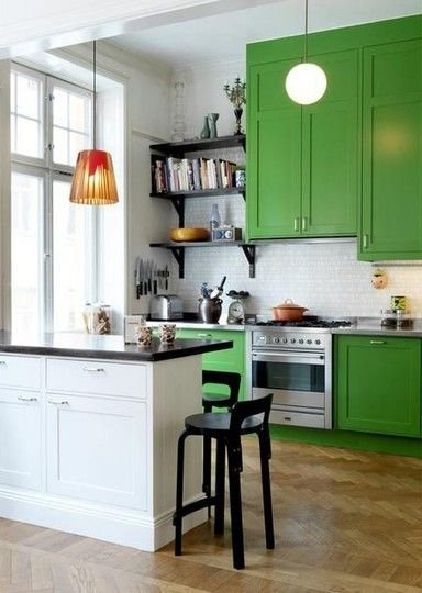
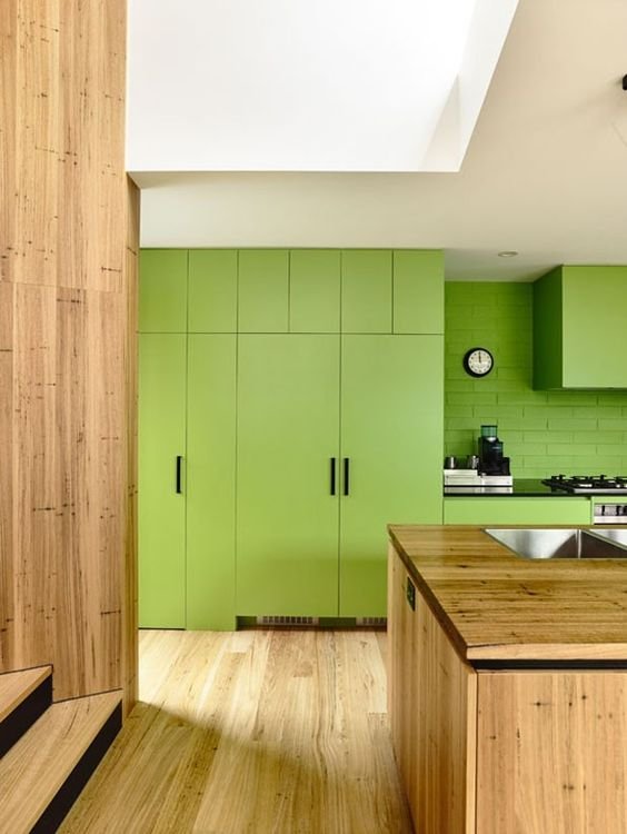
GRAPHIC USE OF GREENERY
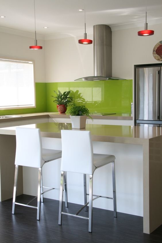
Green looks fantastic when featured with black and white. I dare you to use it as a big graphic feature in your kitchen. It will pay off if it's done right.
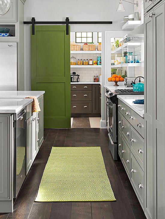
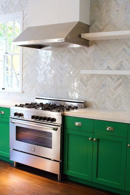
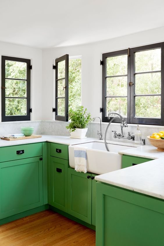
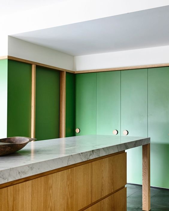
COLOUR BLOCKING WITH GREENERY CABINETS
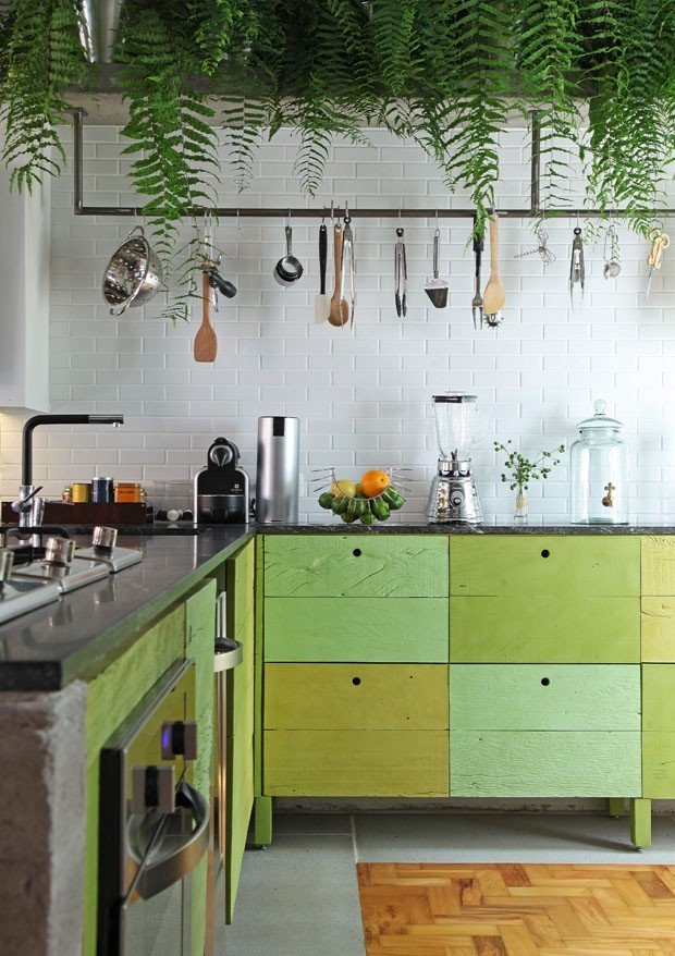
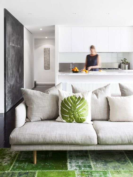
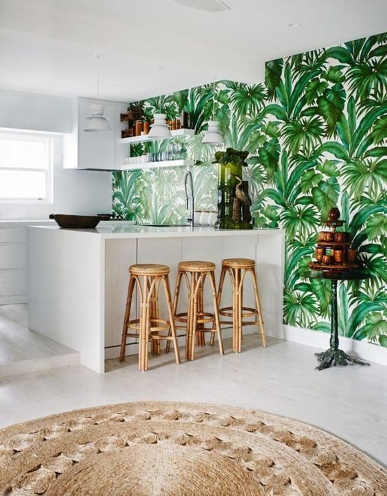
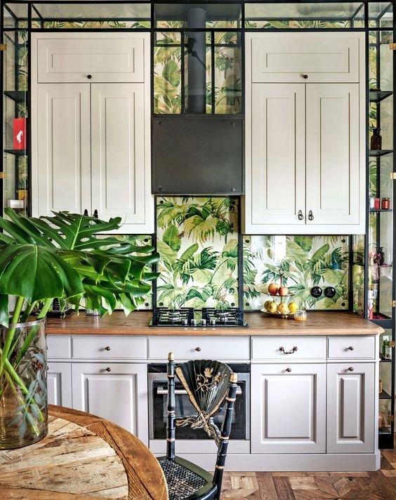
You don’t have to use green paint or fabrics if you don't want to. Why not use real plants? That’s genius.

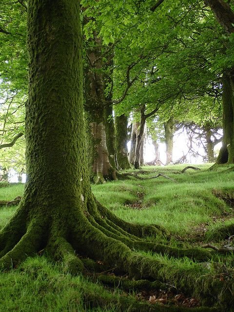
...or let the outside Greenery in.

“Vitality, relaxation and the great outdoors”
According to Pantone, this is how Greenery makes us feel.
cOLOUR MAKES US FEEL A CERTAIN WAY
The psychology of colour is all about how a colour makes us feel. I find it very interesting. Colour is mostly responsible for the atmosphere of a room and it’s so important.
The feeling of size, shape and temperature of a space can be altered with the correct use of colour. Also colour is one of the first things we notice in our surroundings, whether it’s conscious or not.
If you're still not sure if you should use green as an accent colour, think about this...
>Green exudes natural energy and freshness. It represents new growth, abundance, hope, youth, vigour and life.
>In Celtic myths, the green man is the god of fertility and early Christians banned green because it had been used in Pagan ceremonies.
>Today, green is the colour of money and luck and also envy and jealousy.
>Because of it’s strong association with nature, green has healing power and lowers stress. It is the most restful and reassuring colour to the eye.
>A touch of green will work with almost any scheme, because of it’s position on the colour wheel.
>Warm, relaxing olive greens create a calming tranquility, however fresh Greenery will enliven the senses.
This is how Pantone describe it:
“Bringing forth a refreshing take, Greenery is a tangy yellow-green that speaks to our need to explore, experiment and reinvent. Illustrative of flourishing foliage, the fertile attributes of Greenery signals one to take a deep breath, oxygenate and reinvigorate.”
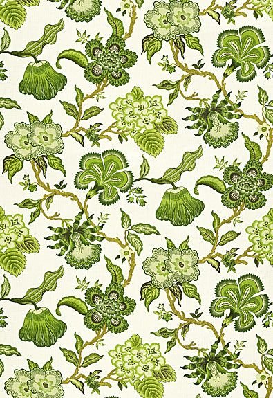
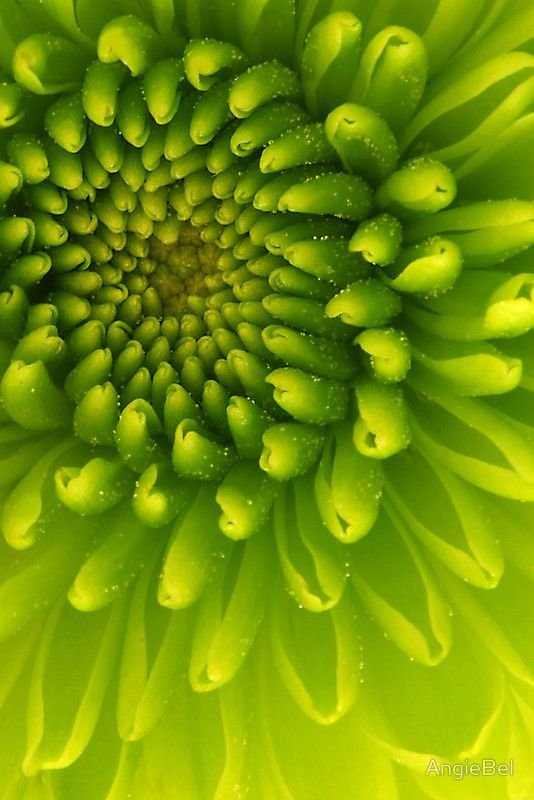
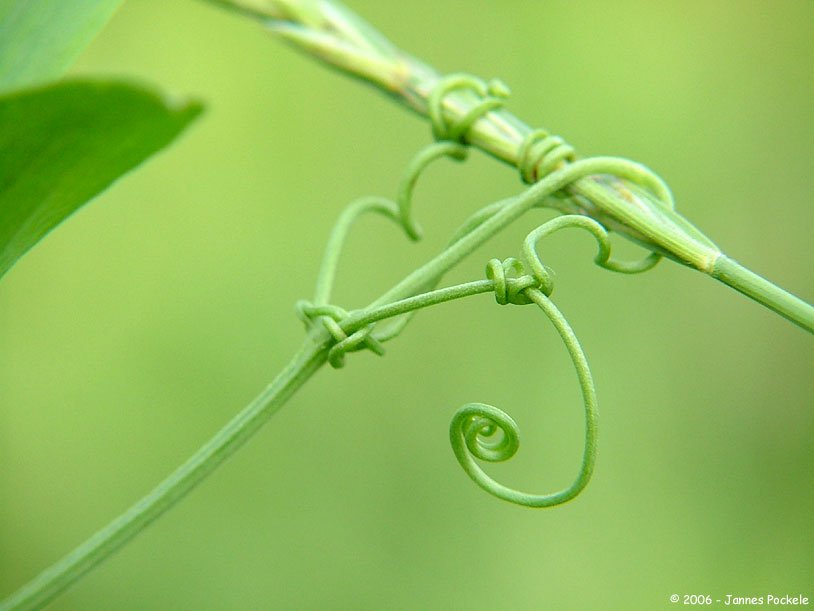
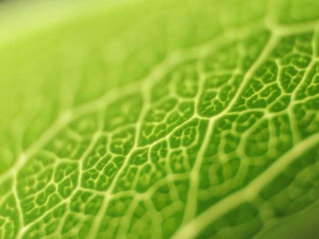
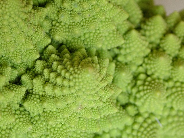
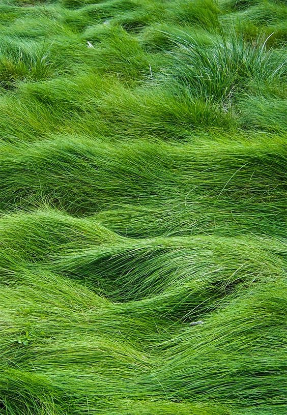
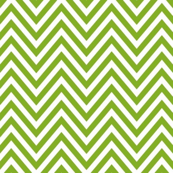
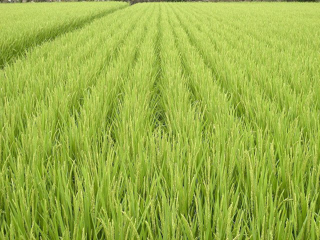
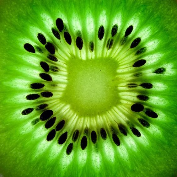
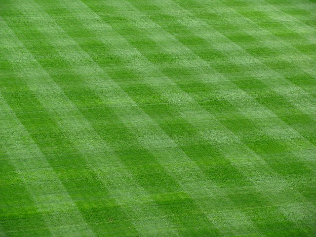
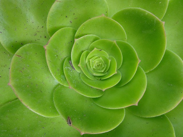
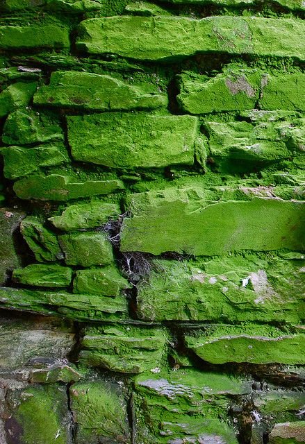
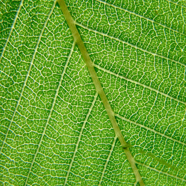
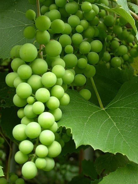
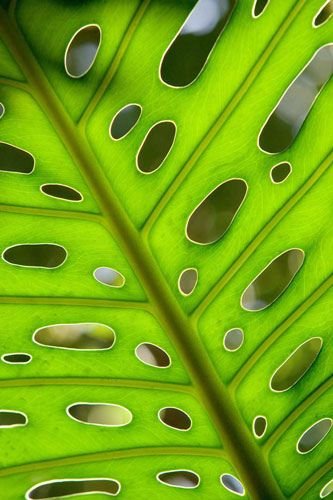
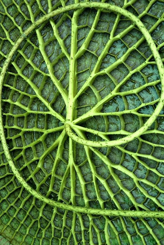
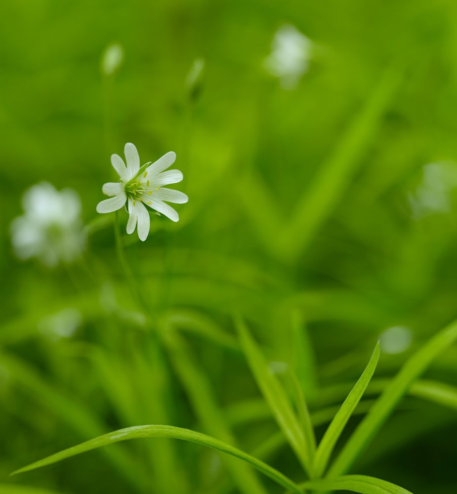
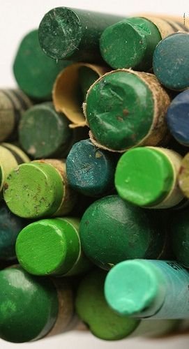
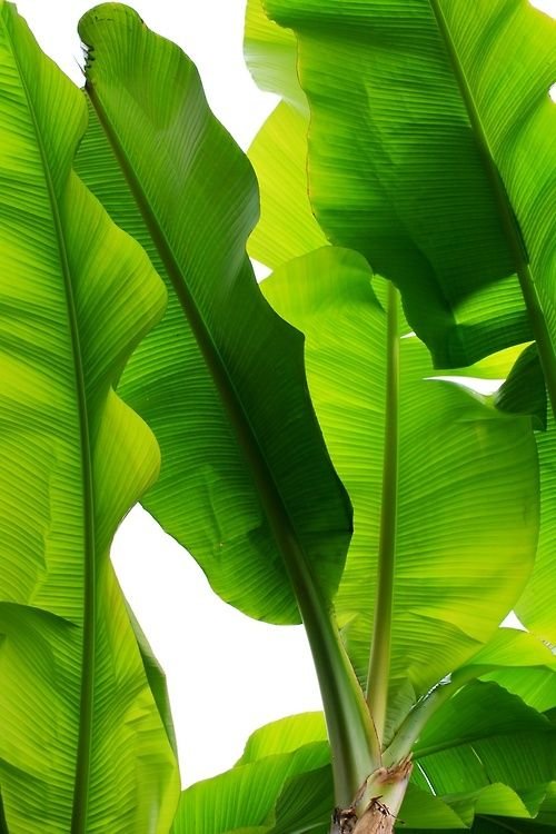
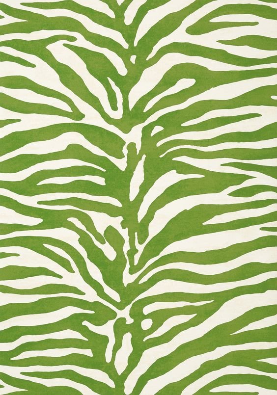
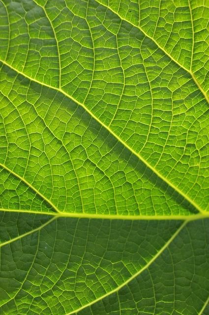
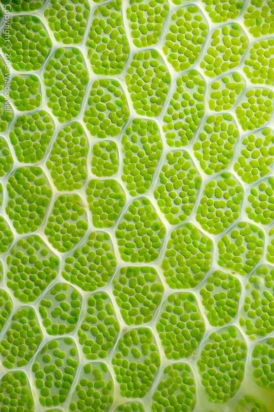
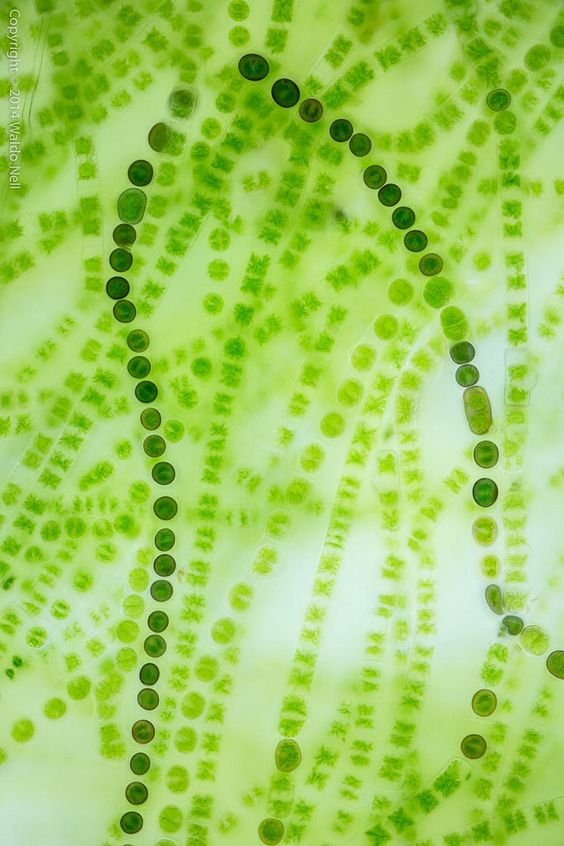
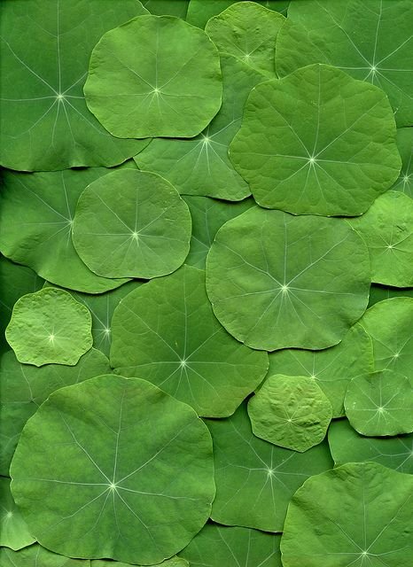
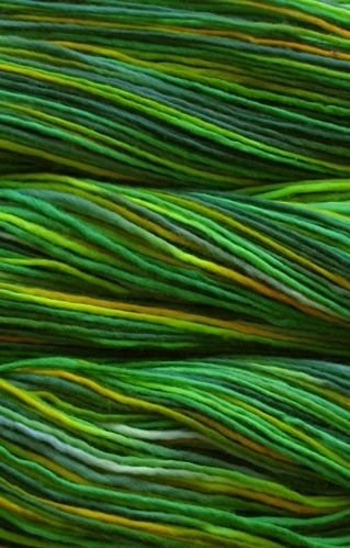
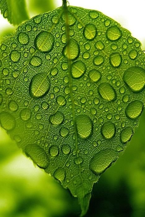
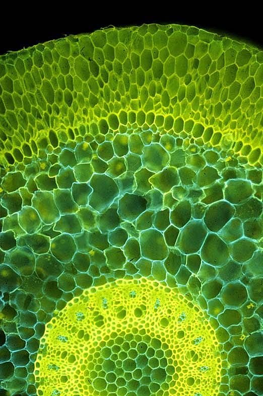
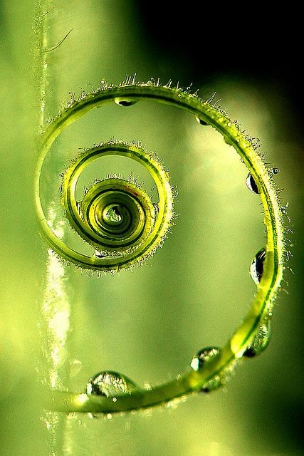
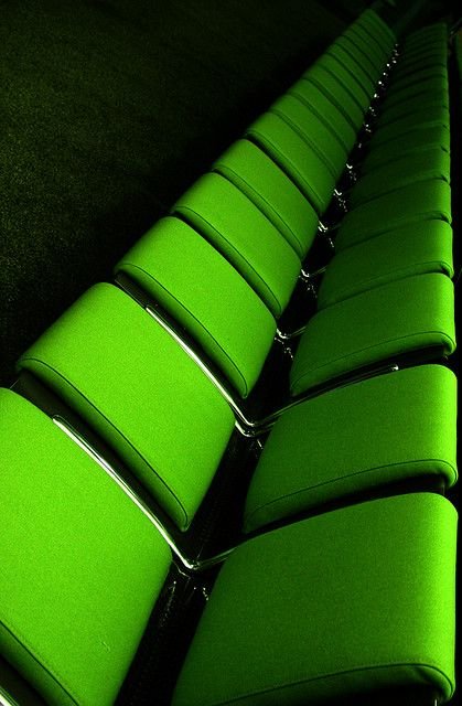
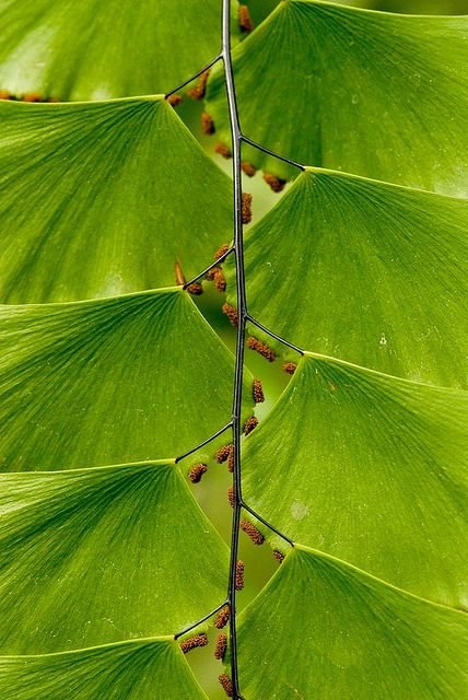
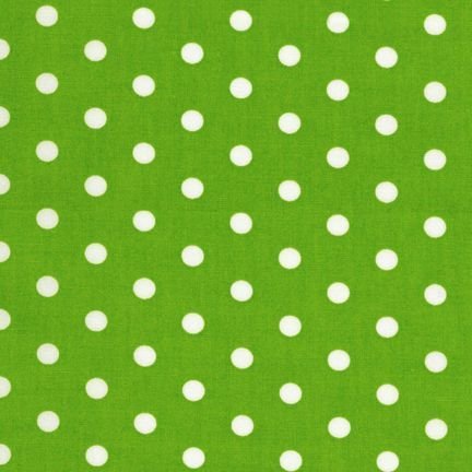
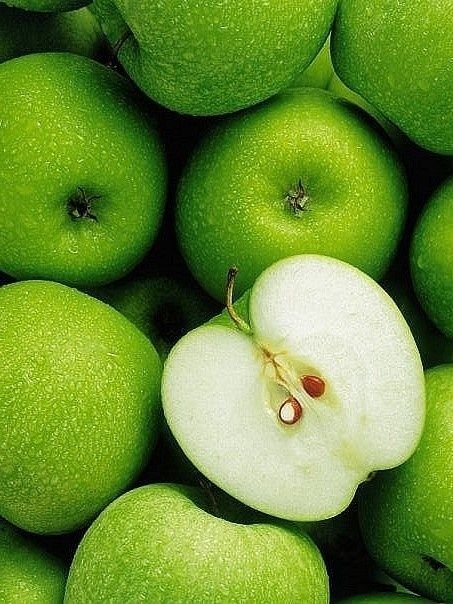
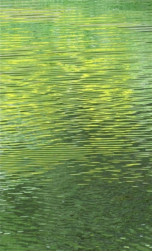
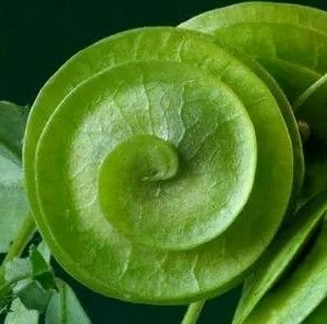
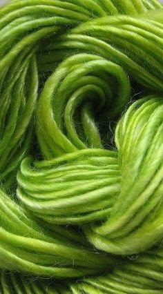
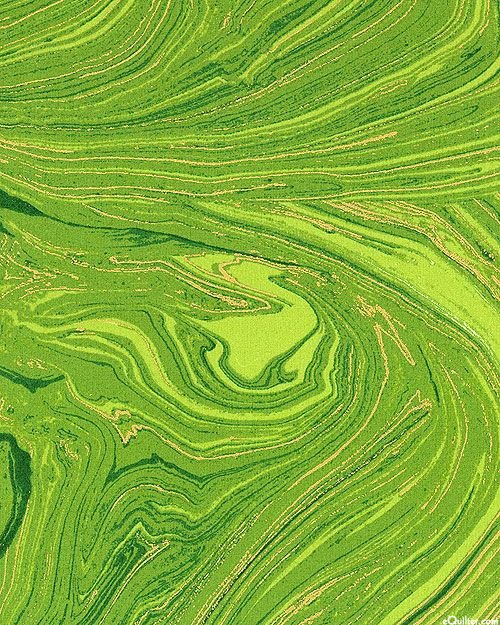
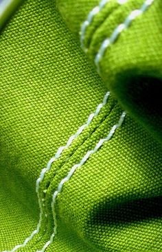
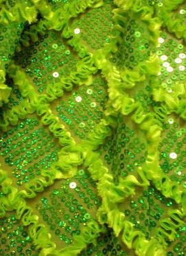
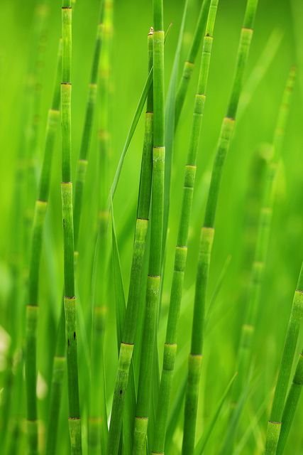
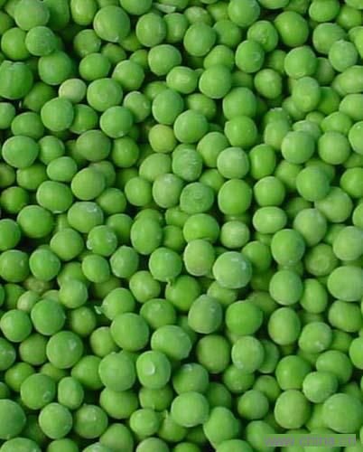
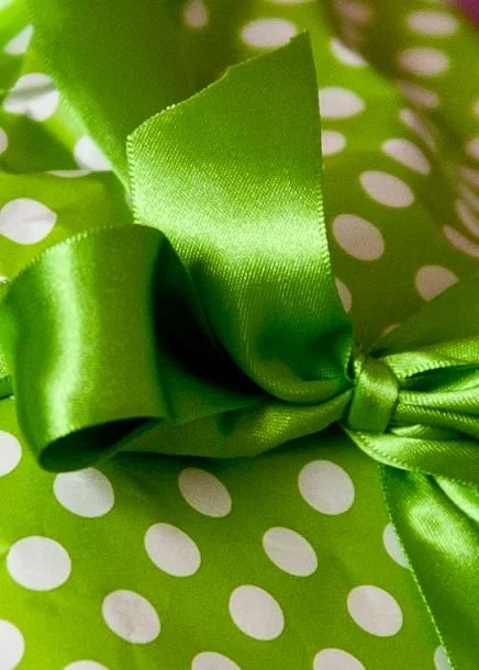
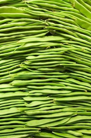
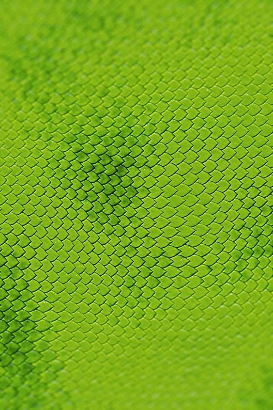
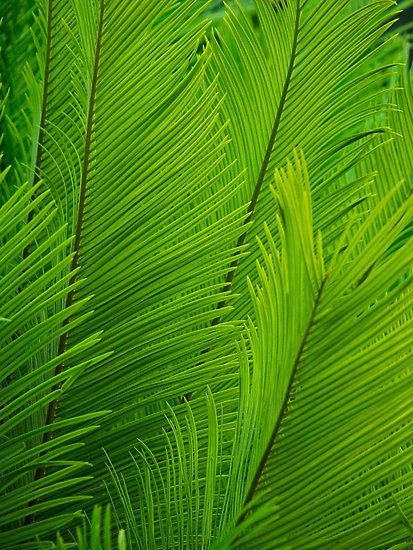
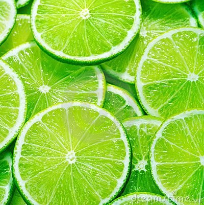
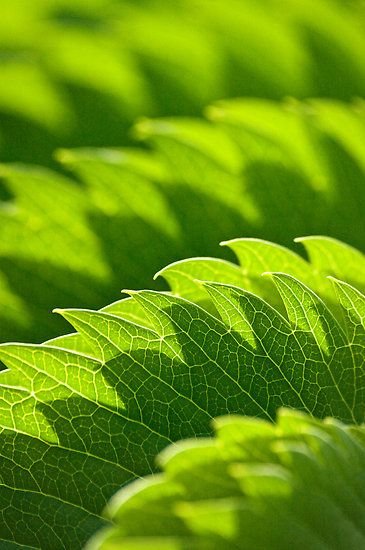
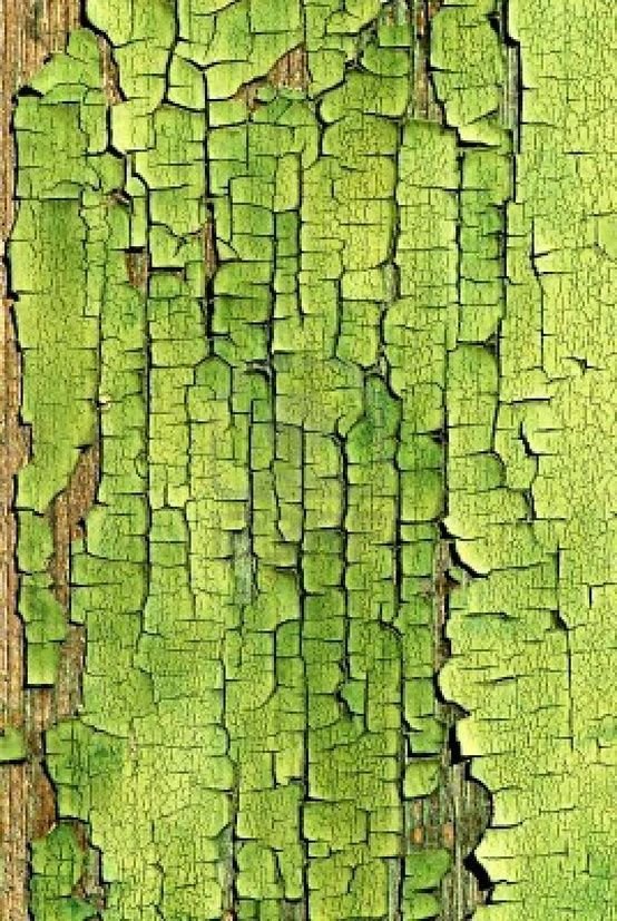
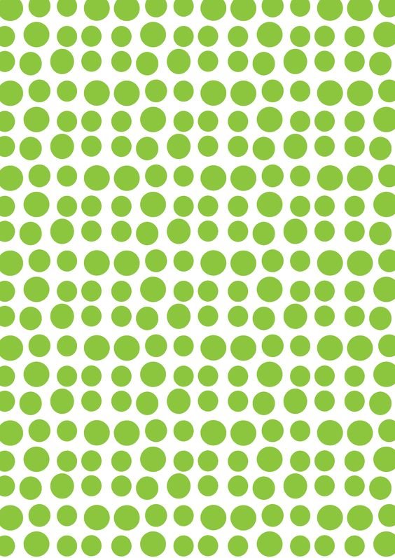
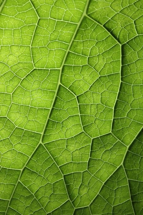
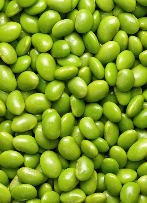
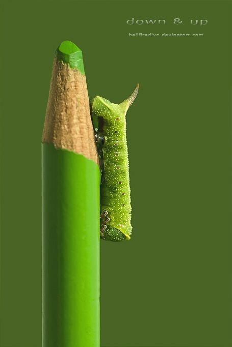
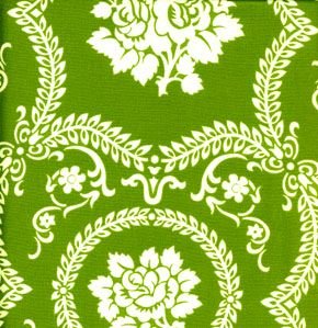
I'm going to leave you now with some Greenery textures and patterns to inspire you. Go and grab yourself a cup of green tea and enjoy!