62 tiled splashbacks you shouldn't be afraid to use
I can't decide which of these splashback tiles I like more.
Moroccan, herringbone, geometric, marble, black, white, grey… oh boy. There are so many options it gives me a headache just thinking about it.
My intent is to help you find something that’ll perfectly suit your project. I’m going to show you the current trends in splashback tiles, with many examples. I hope you’ll be inspired, and more importantly, have increased confidence in your own selections.
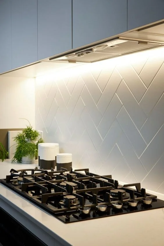
Large format, grey chevron tiles. Image source: getinmyhome.com
The cycle of interior design trends keep everyone in the building industry in business. People always want to buy the newest thing. Thank you trends!
At the moment, plenty of glass splashbacks (especially the ones with a greeny-blue tinge) are being smashed up and replaced with either new tiles, or a stone slab.
Selecting a stone slab splashback is a relatively easy choice to make. It’s usually the same as the benchtop.
However, selecting tiles can be a difficult task if you don’t have any inspiration or experience.
Blue finger tiles, mid-century modern style. Interior Design: Doherty Design Studio
Iriede Nagoya mosaic tiles, made in Japan. You can get them from Academy Tiles
Advice for newbies
People that are renovating or building are always asking me what the heck they should do. It can be incredibly confusing because of the many choices available. Not to mention time consuming and stressful. Especially if you keep going around in circles.
If you have no idea where to start, look for classic colours such as white and grey. Incorporating some natural materials like timber and stone in your scheme works well too.
If you’re not very experienced, it’s wise to keep the colour and style simple when selecting permanent and expensive finishes. You can dress it up later with fashionable accessories and colourful soft furnishings. They can be easily changed and aren’t as costly.
Gloss grey, vintage subway tiles are a classic pairing with a black and white kitchen. Interior Design: Horton and Co Design
Otherwise, spending some time with a good designer (who knows what they're doing) is a great idea. They’re skilled at helping you harness your individual style and they suggest things you may not have thought of before. Designers are very valuable in the long run, saving you many sleepless nights.
Following trends
Tile trends are interesting to follow but don’t get too caught up in them.
We know that the distinctive colours and patterns that are in fashion now, probably won't be in about 7 years. In fact, a sure fire way to tell the age of a kitchen is by the style of tiles used on the splashback. I’m thinking of those horrible brown tiles from the 70’s, for example. Everyone knows what I mean.
The dilemma is that you don’t want your splashback to date too quickly, and you don’t want it to be too generic and boring either.
The trick is to find something on trend but with a little bit of a twist. It should also complement other things in the home, in a tasteful way.
An idea is to find a tile that’s kind of generic but also has exceptional quality, is handmade, or is laid out a little differently.
Plus, if it looks amazing, it doesn’t matter if it’s in fashion or not, does it? Trust your instincts and have faith that your own taste is good. Get a second option if you like, but just go for it.
Black and white Moroccan cement tiles in this colourful kitchenette. Blogger and designer: Old Brand New
You can get them here
If you’re looking for a splashback with texture and a bit of personality, maybe something a little bit different than usual, here’s some suggestions:
Encaustic Cement tiles
A matte concrete-like tile, with an inlaid traditional pattern. There’s some fantastic modern geometric designs available too.
They usually consist of two or three colours, because of the way they were traditionally made. The pigment is pressed into the surface with moulds. Sinking a few millimeters in and becoming a part of the tile structure. Patterns aren’t printed or painted on the tile, like you may expect.
Farmhouse kitchen with a California cool vibe. Using minty, Spanish inspired cement tiles behind the stove. Interior designer: Ashley Gilbreath
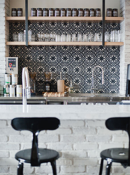
Bold black, white and grey encaustic cement tiles in this industrial-luxe cafe bar. Designed by: Nam Dang-Mitchell
tiles: here - similar
Dusty blue, grey and white Duquesa Cement tiles. According to the manufacturer, the Fatima design shown here draws inspiration from 16th century Italian textiles, Portuguese tile, and Moorish mosaics.
Hand-crafted cement tiles. If you look closely, there are Rabbits and Deer on these tiles. When you place an order, you can actually choose how many of these little creatures you want on your splashback, how fun!
Grow House Grow Otomi Cement tile: here
Encaustic tiles are a very old invention and have been around since medieval times. Historically they were made with different colours of clay. Not glazed, not fired, and incredibly porous.
They have a handmade, imperfect quality to them. Worn out areas and stains are tolerated and are part of the charm. However, many people opt for a porcelain look-alike, for ease of maintenance and affordability.
They can be used in a modern or a classic setting. Anywhere that benefits from a bold pattern.
Encaustic cement tiled niche in this industrial-scandi kitchen. Image credit: Leva & Bo
Geometric patterned, navy and white tiles. The mix of modern and traditional is very well done in this drinks / sideboard area. Interior designer: Katie Hackworth
Mogador Cement tiles, made in Morocco: white with black | black with white | grey with white
They particularly work well in older homes with period details. Traditional Australian homes, such as from the Victorian or Federation era, have encaustic cement tiles influenced by England at the time. You’ll often see them with tessellated tiles in the front verandah.
English encaustic tiles have a very rich history. You may come across others from Spain, Portugal, and France, to name a few.
They would suit a French Provincial style aesthetic very well. If you’d like a guide to designing a kitchen in this style, check this out:
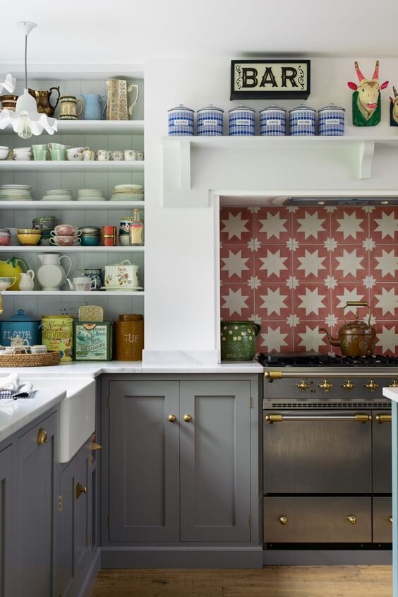
Playful red and white star tiles in this British kitchen by deVOL. They’re Spanish encaustic tiles made with natural pigments.
Moroccan encaustic tiles are a subcategory that are very popular right now. Particularly for bathroom floors and splashbacks. They add dramatic flair and impact to any home.
The patterns are very sharp, contrasting and intricate. Using geometric shapes such as stars, lozenges, squares and circles. They’re inspired by the tiny mosaics that adorn the walls, ceilings, fountains, floors, pools, and tables in Morocco. We can thank the Moors for this Islamic art.
Mediterranean encaustic cement tiles featuring a happy sunburst pattern. The 8 point star motif is often found in traditional Moorish tiles. Kitchen designed by Hello Kitchen
Medina Blue, Yellow, and White Encaustic tiles here
Morocco is in the Mediterranean region between Spain & Africa. The home of exotic cities such as Casablanca and Marrakesh and they’re very famous for their tiles. Visitors are always amazed at how their intricate tile patterns cover every inch of the place.
You may have noticed that Bohemian style interiors have many Moroccan influences. This may be the reason for the current popularity in Moroccan tiles. Boho style combines a vintage and global look, using lots of textures and interesting, unique pieces. Including Moroccan woven rugs, macrame and lots of indoor plants!
Zellige Moroccan tiles
I’ve recently discovered the name of these tiles but I’ve seen them everywhere. They’re actually glazed terracotta tiles from Morocco.
Fresh, modern, coastal kitchen with blue Zellige Moroccan tiles. Interior design: Decus Interiors
In Morocco, zellige (also zilij) is the term used for all types of terracotta tiles, and they’re usually in the form of mosaics. In any shape, size or colour.
In the west, we categorise them as handmade, shimmery, pearlescent tiles. Almost like sequins, they have a particular shine that comes from all their flaws. Their drippy translucent glaze makes them look like they’re wet.
There are many beautiful vibrant colours, as well as black and white. The trend is to use all one colour and set them out in a simple grid of small-ish squares.
The handmade white Zellige tiles add texture to a mostly white scheme. Interior design: Carole Whiting
square zellige tiles: here - several colours available
Another example of white (or off white) Zellige tiles for the kitchen splashback. Interior Design: DISC Interiors
Elegant black Zellige tiles. Image credit: Elle Decoration
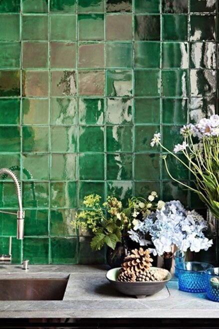
Dramatic green Zellige tiles feature in this Parisian kitchen. Interior Design: Studio Ko
Another unique feature are their hand cut edges. They butt very close together, with very little grout line (about 1mm thick). This comes from the traditional tiling technique in Morocco.
A word of caution when ordering: there will be irregular tile colours and sizes. Pits, cracks and edge chipping are also to be expected. Embrace imperfect perfection (find a very good tiler) and everything will be just fine!
Tip: When making your final decision, order at least 3 sample tiles of the same colour, this will give you a better idea of the final outcome.
Fish Scale tiles
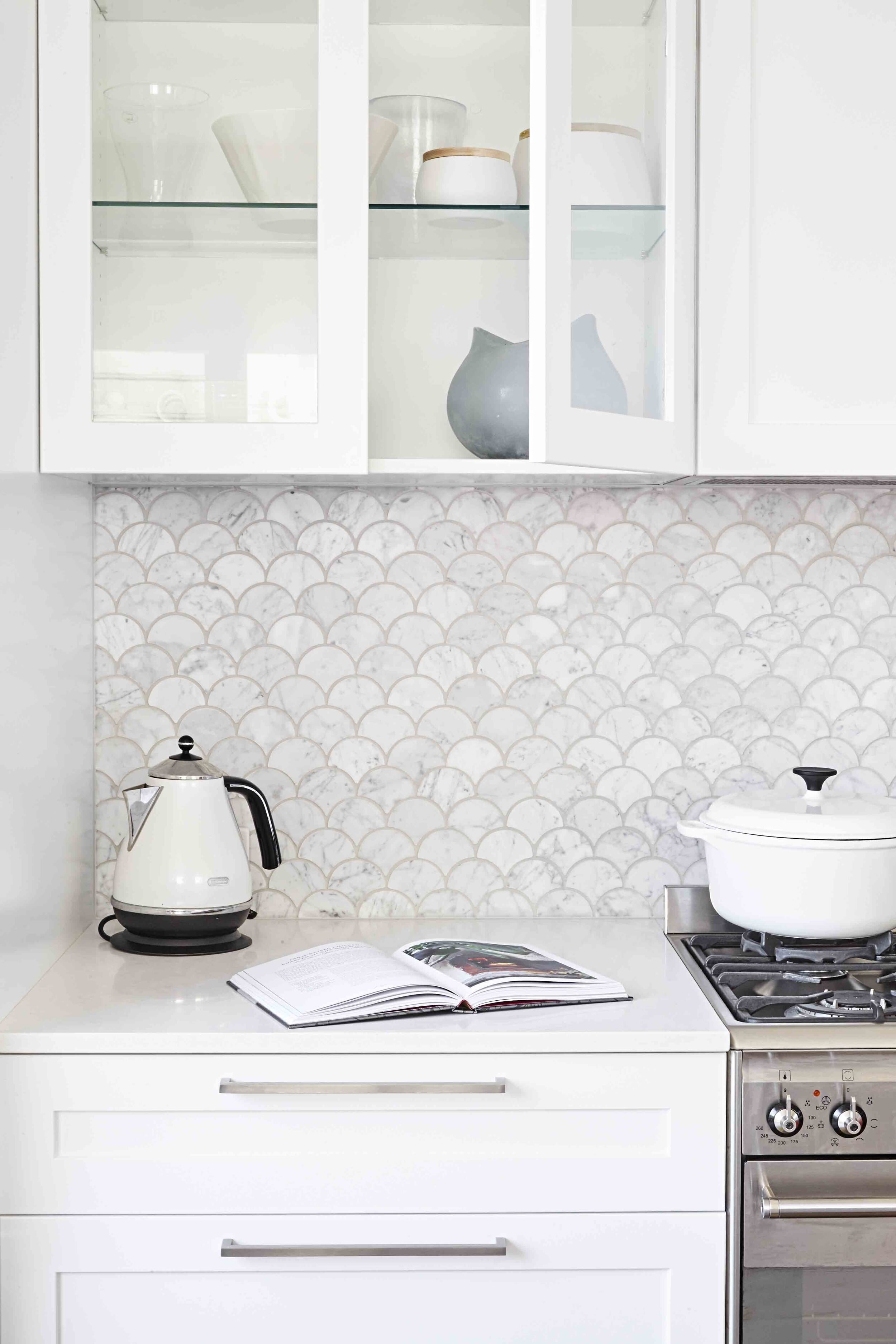
I can’t neglect to mention the iconic Moroccan tile shape, fish scale (or fan). They look like waves in the sea, especially if the colours are blue and green.
An ocean theme is great for wet areas such as bathrooms and kitchen splashbacks. However you’ll see them most commonly in white, which is a sophisticated look and a slight nod to the Moroccan style.
These fish scale tiles are almost reptilian. Very cool. Image source: Australian House & Garden
fish scale tiles: here - similar
Herringbone tiles
I had an “Ah Ha” moment as I was browsing the interwebs. I hadn’t put two and two together before. Apparently the pattern’s called Herringbone because it kind of looks like a fish skeleton. You’d have to have quite the imagination to see fish bones here, or is it just me?
Classy gloss white herringbone tiles with a darker grout. Image credit: Remodelista
Herringbone’s been used since almost the begging of time. On Egyptian jewelry and textiles, roman paved roads, and of course parquetry floors - particularly in France.
In the home, it’s been so popular on floors that it’s made it’s way to walls too.
Green Zellige Moroccan tiles in a herringbone pattern. Striking. Interior designer and tile supplier: Georgia Ezra
It’s an interesting spin on the use of subway tiles for splashbacks. It suits both traditional and modern homes. Notice that your eye moves in the direction of the arrows. Perhaps leading your eye up, making the room feel taller.
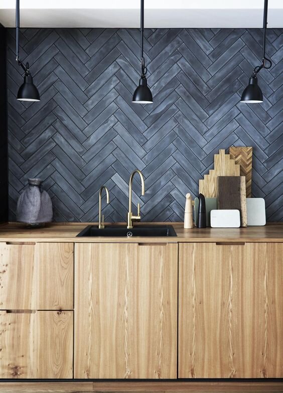
Dark gray, Moroccan cement tiles laid in a herringbone pattern, creates quite a statement in this Copenhagen kitchen. Image credit: Skona hem | tiles: Stix Storm from Marokk
It’s a pattern that’s been around for a long time, and people are comfortable using it on their splashbacks because it’s a classic and they feel like it won’t date.
Herringbone tiles give a space the look of quality. The interlocking arrangement makes it an incredibly solid surface. It looks very well made and screams luxury.
Matte white herringbone splashback in a modern kitchen my Freedom Kitchens, as seen on TV show Reno Rumble
Herringbone variation using twin handmade tiles. Image credit: Salt at Shoal Bay
Geometric tiles
With white tiles being so incredibly popular, it’s no wonder people have been exploring different geometric shaped tiles to add interest.
I’m talking about plain coloured tiles in the shape of hexagons, cubes, diamonds, crosses, pickets, or kites.
The sharp, clean lines of this type of splashback really complements modern cabinetry design. It pairs well with plain, flat doors and square edge benchtops. I can’t help but notice the slant towards mid-century modern design too.
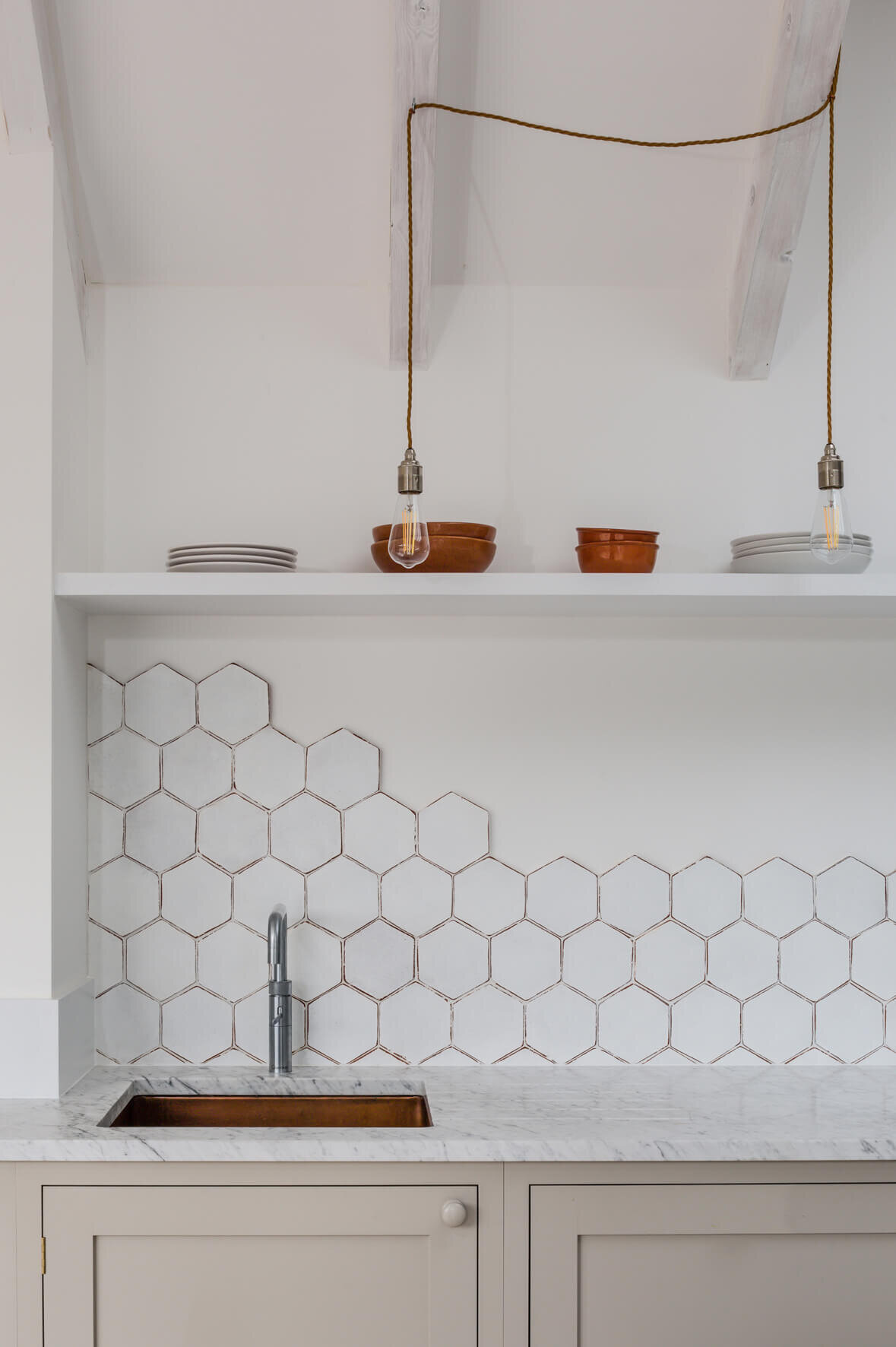
Matte white hexagon tiles adds modern texture to this kitchen. Image source
White chevron tiles with grey grout. Kitchen designed and made by: Loughlin Furniture
White geometric tiles are never boring. Interior design by HGTV personality Jillian Harris
Interlocking “H” shaped geometric tiles called Chaine Homme, by Fireclay Tile. It has a mid-century modern appeal.
3D cube geometric tiles in white. Kitchen designed and made by Cantilever Interiors
Matte white, picket shaped, handmade clay tiles. Interior design: Melinda Faranetta
Tiny tiles
If tiny tiles are arranged into a pattern, the proper name is mosaics of course. But I’m referring to very small scale tiles, arranged in the same pattern as what you might find with larger ones.
Consisting of one colour (or material), tiny tiles create a fantastic, intricate texture.
Penny rounds are a classic tiny tile, I’d be surprised if you hadn’t heard of them. I’ve noticed them more often in bathrooms than kitchens. Tiny hexagon tiles are a variation on the round ones.
I’m loving the finger tiles that are stacked on top of each other so that look like sticks. And very small herringbone patterns, looking almost like the weave in a suit.
White finger tiles looking good in this luxurious modern kitchen, St Kilda East VIC. Architect: Luke Fry
Tiny white tiles in a herringbone pattern with dark grout, a woven fabric look. Architecture & interiors: Fogarty Finger
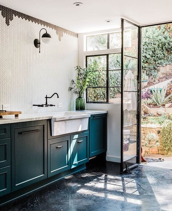
More tiny herringbone tiles but with a lovely black detail at the top. It feels a little Art Deco. Interior Design: Gamble + Design
Tiny white hexagon tiles creating subtle geometric details in this butlers pantry. Interior design: Doherty Design Studio
The unfinished edge
My Pinterest feed is currently showing me lots of tiled splashbacks with the edge left raw. There’s no trim to finish it off, creating a zigzag edge. I quite like it.
I imagine it would save the tiler quite a bit of time too :)
I love the edge detail on this splashback, using unfinished 3D cube shaped tiles. French farmhouse kitchen with black steel cabinets from Vipp
Tiny herringbone tiles with unfinished zigzag edge, lovely. An artist’s home, photo credit: The Design Files
An unfinished edge using white subway tiles (on diagonal) and black wall is quite dramatic. Image source: Topps Tiles
White hexagon tile, left unfinished but it looks great. Architects: Reed Watts, Kitchen: deVOL
Grid tiles
Simple square or rectangle tiles, laid out in a grid. Also called straight lay or stack bond. This may sound a little boring but I’m seeing them a lot lately and they look quite good.
To me they’re a bit daggy-cool. It gives a room the feeling of a simpler time. They’re sort of nostalgic. I think these tiles are due for a comeback, in a big way. After the subway tile craze.
I notice them all the time in authentic Scandinavian kitchens. You too can capture the hygge home (pronounced hoo-gah) with these tiles!
Design tip: when planning the size of the space to be tiled, it’s best to use all full size tiles (no cutting). Keep in mind the size and quantity of tiles plus grout for the accurate measurement.
Simple Scandinavian kitchen with white grid tiles. Photography & Styling: Daniella Witte
This all white kitchen is made interesting with simple grid tiles. Image source: Decorfacil
Handmade white butcher tiles in a simple grid pattern, cover many surfaces in this spectacular kitchen. Designed by: Minosa
Luxe and rustic kitchen featuring handmade tiles laid in a simple grid pattern. Interior Architects: Frederic Kielemoes and Vanessa Cauwe
Subway tiles
They were called Subway tiles originally, as they looked like the tiles in the New York Subway, with their brick bond layout (the British call them Metro tiles for obvious reasons if you've ever taken the tube).
Now they've evolved into the name for any rectangular shape tile and can be placed in a herringbone pattern, stacked, or any layout you can think of.
Their popularity is still going strong, we’ve seen them for a long time. But now we’re seeing them longer, leaner, and textured. Looking more like a glazed brick. Often handmade with not-so perfect edges and faces.
In case you were wondering… Brick Bond means the tiles are laid out like bricks in a wall. The end of each tile is lined up with the centre of the one below it, in other words they’re offset by half. Its not just for rectangle tiles, square tiles can be used too. Other names for Brick Bond are Stretcher or Running Bond.
Long, brick bond subway tiles looking modern and timeless. Interior design: Turton Oliver
Large format tiles
If you need to make budget cuts or you've run out of money at the end of the project, these are a good choice. You could also use the same ones on the floor for a cohesive look.
Use large format, stone look tiles that have rectified edges (which means the edges are square cut and you can hardly see the grout lines). These may look more expensive than standard (subway) tiles, and they’re very easy for the tiler to lay.
tip: make sure you allow the exact amount of height for this in the splashback area so there's no cutting. e.g. 605 mm allowance.
Affordable concrete look tiles on this laundry room splashback. Image source: getinmyhome.com
The large grey tiles and sawn cut oak have a beautiful natural texture. Kitchen is in Norm Architects Copenhagen studio.
Large format marble tiles for a clean, Scandinavian look. Blogger & stylist: Elin Lannsjo
Marble tiles
We’re talking about honed Carrara marble. To put it plainly, it’s a natural stone that’s been cut out of a quarry.
Natural products are real and make you feel at one with the planet. You might be attracted to it because you don’t want any nasty chemicals invading your home. Unfortunately, the fact that you need to seal it regularly to make it non-porous, means this a moot point. Look for sealants with low VOC if you’re concerned.
A honed finish gives the marble a flat matte to low-sheen gloss. It’s very smooth and has a great feel. You just want to run your fingers over it… all. the. time.
It fits nicely with a classic colour scheme of black, white and grey. And it suits almost every style, from modern to traditional.
I think marble tiles are particularly fabulous in Hamptons style homes. If you would like some tips on how to design a Hamptons style kitchen, check out my post here.
Stunning marble herringbone tiles in this laundry. Designed by Kerrie & Spence, channel 9’s The Block. Image source: getinmyhome.com
Carrara Bianco Penny Rounds tiles, cute as a button! Designed by: Rebecca Judd - The Style School
Moroccan fish scale tiles in carrara marble. Beautiful (and looks very expensive). Interior Architecture: Sally Rhys-Jones
Classy marble tiles in a diamond shape. Interior design & styling: Aimee Tarulli
Metallic inlay tiles
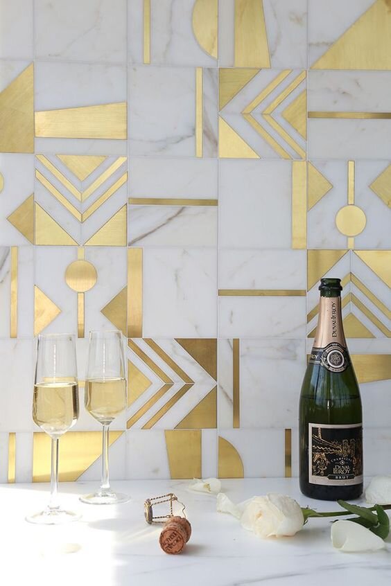
We all know about using a contrasting grout to outline tiles and create a graphic punch (such as black grout with white subway tiles). A metallic inlay, with marble, takes this idea to another level.
It’s something you may have seen on the floors of grande hotels. A geometric pattern would be perfect for an Art Deco inspired design or perhaps for a more traditional Regency style.
I can see this working as a splashback, especially if you’re using the same type of metal for your fixtures or other decorative pieces. Brass, gold, or chrome… bling-a-ding-ding!
Lovely use of gold in the vertical grout lines of these brick tiles are. It also ties in with the handles. Designed by Gretchen Black for Artisan Signature Homes
Brass and Calacatta marble mosaics from France, made to order: Mosaique Surface
Geometric marble and metallic splashback. Photography: Stephani Buchman | tiles: Akdo Allure Collection
Black tiles
For a punchy, dramatic effect, use black tiles. They’re great for an industrial style home or executive, inner city apartments. You could also use it to add more sophisticated class to a space. Perhaps for a nightclub bar effect, a bit of glitz and glamour.
Keep in mind: black tiles show more marks than white tiles. Consider using enough texture to combat this. Think about it…which car is easier to keep clean, a white car or a black car?
Are you considering going all out with a matt black kitchen? Get some more inspo here.
Industrial style kitchen with dark, dramatic tiles. Clever use of white grout to accent the honeycomb pattern. Styled by: Rachel Vigor
North Fitzroy, Graphite Apartments that embody urban style living. Matte black subway tile, brick bond layout. Interior Design: Mim Design
Timeless Los Angeles kitchen with black Zellige tiles and white grout for a graphic look. Interior Design: Chris Barrett
Black gloss penny round tiles for a glamorous evening drinking cocktails. Designed by: GRT Architects
An all black colour scheme really benefits from texture in the tiles. Architects: Splinter Society
Pink tiles
Some call it blush, some call it millennial pink. I don’t care if it’s girly, it just makes me smile. It’s a trend I’ve been seeing more and more of lately.
It's a bit daring but I love how it pairs with terracotta, copper, grey and black.
Blush tiles: styled with copper, concrete grey benchtop and wall, black tapware and cabinets. Image source: Cote Maison
Light pink chevron tiled splashback, stunning! Design & Build: GIA Bathrooms & Kitchens
Soft pink tiled splashback with black Ikea kitchen. Here’s an interesting side note, the cabinets are made from recycled plastic bottles. Industrial Design: Form Us With Love
Soft pink tiles, blonde timber cabinetry and crisp white details. Interior design: Bicker Design
Soft blush, Italian marble tiles with a tumbled edge, called Rosa Perlino. Image source: Mandarin Stone
Tuscan pink tiles feature in this stylish Melbourne cafe. Interior Design: Golden


